New Projects

Hellooooooo,

It has been awhile since I’ve posted here. I have plans for that to change, slowly. You’ll start to see more posts, more projects, more “how did she do that” from me going forward. 

For now, I want to introduce you to one of the “many” projects I have in the works. 

This project centers around Lake Superior, and how she changes (yes, I see this beautiful lake as a feminine spirit) month to month.

My plan is to drive north once per month, and photograph the same four locations. The main photographs will be taken with my medium format Hasselblad 501c/m camera using Ilford black and white film. I of course could never leave the house with only one camera, and will be sharing instant film photos, as well as digital photos, over the next several months.

I started these trips in May.

My first trip on one of those beautiful hazy mornings, when the horizon blurs together. This image was taken in Canal Park in downtown Duluth.

I’m not entirely certain where this project will lead. I have hopes of where I would like it to go, but we are still in conversation about details. This is a different project for me. I will never get tired of seeing the lake, or of the drive up 35W to the shore. But I don’t usually stick to a regiment like this, photographing the same place every time. 

Still, it fascinates me.

The idea started scratching at me after I had read Sally Mann’s book ‘Hold Still‘. This is still one of my favorites of the biographies I have read recently. She describes a project she was working on, photographing deep parts of the south, loading up her station wagon with wet plate collodion chemistry and her large format camera, and just driving until she found what she was looking for. That very idea calls to me, and every day it takes a lot of will power to drive myself to work instead of driving out into the wilderness in search of photos. 

In some ways, this project is a baby step towards that. A project that keeps me going out and coming back at a regular frequency. Something with just enough structure to keep me grounded, but plenty of room for freedom. 

Stay tuned. I’ll share more images from this project soon.

Thanks for sticking around. You’ll hear a lot more from me now. 

~Peace~


Sometimes the baby steps seem boring

It has been awhile again since I have posted, but I have been hard at work on this project since the last update.

All along I knew this series would involve a lot of experimenting. I am far from an expert at this medium, but I am in love with it. I have learned to use new equipment, work in a different environment that what I have in the past…

All of these lead to much trial and error. When it comes to trying to keep up a blog about a project, it often seems like all the trials, and especially the failures, are boring to talk about. But they have their place in this journey as well, and it is time some of them are acknowledged here.

Nikki Schneider, the printmaking professor at ARCC, the studios where I am creating this work, encouraged me to test out a bit of the graphite color ink we have in our supply. Her words were “try it, I bet you fall in love, and then you’ll buy your own 1-pound can of it”. She was right! I tried one of the not-so-successful prints with it, and fell in love with the tones. Off I went to buy ink.

I have heard so many people love the Akua soy based inks. Doing anything in a way that is somehow better for the environment is always on my mind, and I felt I should give them a try. So I bought two colors, one of course being graphite, and headed back to the studios. I never posted any of those results here, because they are not good. The inks are very runny, and very light. I tried modifying them, but could see right away that it was going to take a lot more work than what I had time for. I was discouraged, and after many conversations with the other artists around me, I went back to using oil based inks. I’m not giving up completely on the soy inks, but I can’t dedicate that much research time to this series on ink alone.

The last print I posted here was one of the best plates and prints I had made so far. There were still parts of the image that were not quite right though, and needed adjusting. Part of the back ground was a bit too blown out, and the layer with the street signs was showing through too dark. Now the challenge of making those fine adjustments, and making another plate.

okinawa

I like how this print turned out better, and I am thrilled that I am getting the hang of adjusting the image to what I need to make a plate that I want. This has been the hardest (and possibly the most expensive!) lesson to learn through all of this, but it is encouraging to see the progress.

Last week I also did some experiments with color. My earlier work has been full of bright colors, and while I don’t expect (or want) this medium to take on the same qualities as my earlier work, I am very curious about how color choices will play into this series of images. Most of all, I wanted to know how possible it would be to ink and wipe a plate with two colors of ink on it. How much control would I have over the edges where the colors met? Or would everything just mix together to be an ugly brown blob?

It turns out, inking a plate with two colors is not that hard. What is harder is feeling that I have mixed the right colors, and that the colors are actually adding to the feeling of the image. I still have a lot of research to do on that piece of the puzzle.

trees-hard-two-color

The first image I made with a much harder edge between the two colors, and I was surprised at how easy it was to control where that edge would be, and how I could control what blended and what didn’t.

trees-blended

The last print I made in that short run, I blended the edge a lot more, letting the colors bleed in to one another. I know I have a lot more questions and challenges to work out with this, but it is exciting to see that the potential is there.

So far all the images I am working with are double images. This is a challenge with this process as it is very easy for areas to get too dense, or to not have enough detail. I have not yet mastered it, but from my first many trials, I am learning a lot about what type of image I am looking for and what the transparency should look like.

I have a long way to go still before this work is displayed this summer, but I am feeling perhaps a bit more sure about myself with this. Every time I make a plate, and pull a print, I am thrilled to be working in this way, and letting myself run wild with future possibilities and projects. And that is something I can not give up on.

I know I have jumped with both feet into the deep end. Thank goodness for all that taught me how to swim!

The successful print

Thursday I went in to the studio before my work shift started, intent on making one large plate. Maybe a print too, but for sure a plate.

I cleaned the plate maker, clean glass, new transparency.

Deep breath.

Light coating of baby powder on the plate and giving the vacuum table time to run and settle before flipping it over for exposure.

62 light units for the aquatint screen.

3.7 light units for the image.

One of the students followed me into the darkroom to watch the plate develop.

15 seconds of just water swishing. 40 seconds of brush washing. Blotted dry with smooth newsprint.

“I’m so excited!!”, the student watching said.

Yeah, me too.

I dried the plate. Time for post exposure. This time I taped it to the outside of the glass so nothing could stick to it.

“Are you going to print it!?”, I’m asked. Looking at the clock, I have just enough time.

I ink it, and pull one print before I am scheduled to work.

photogravure-image-whole-small
It is the best print I have gotten since starting this project with this medium and this plate burner. No, it isn’t perfect, there are areas I want to tweak, and make a new transparency and a new plate and try again. But this is the first that doesn’t have the spots, the splotchy-ness, the fuzzy edges, the uneven exposure. I know the steps, I know what I have to do. Now I just need to work on the images.

Stay tuned! Those are coming!

Progress! Sweet progress!

There was a lot of testing done. And over the last two weeks I have spent a lot of time with this little machine.


After spending many hours one Sunday making test strips out of polymer plates, I knew I was close with the exposure times.


Results like this kept me going. Not perfect, but better. I started testing plates that were just a little larger. I know that this series will have layered images. But I was uncertain how that would translate to this medium. I realized there were two approaches I could use. 1. To make the layered image in Photoshop and print a transparency with them layered like I want, and make a plate from that. Though I figured that would be challenging due to the fact that layering images in Photoshop can make some areas very dense, making a difficult image to make a plate from. Option 2. would be to split up the two images, make a separate transparency and separate plate of each and do the image layering on the press. I knew this would be a challenge to get the images to blend together smoothly, and registration of plates so they lined up during printing could be a night mare.

I started playing with images, and trying both ideas. It also gave me a chance to play with ink tones and colors a bit. Everything was helping, and getting me closer to what I wanted. I could see that. But nothing was “it”.  The exposures were decent, but the images were fuzzy, and spotty. I started doing more research through blogs to troubleshoot what was happening.

img_4497 img_4498

Once I had learned more about what could be going wrong, and after a pretty rough week, I decided to try one more plate. I was somewhat confident that I knew what was happening, that my aquatint screen and my image transparency were not making good enough contact, due in part to the fact that I was using a smaller plate to test, but not necessarily using a smaller screen or image. I was trying to save money in plate material to test, but it wasn’t necessarily giving me proper tests.

So I took a deep breath, and jumped in. Stay tuned for how that turned out!

Cover art!

I’ll be back soon posting more about my photo polymer photo gravure project. But I have to take a break today to share this bit of excitement:

Rain Taxi, a great local non-profit centered around literature puts out an amazing publication, and asked to use my artworkThe Night of the Eclipse the Whole World Shimmered‘ on the cover of their latest issue! It is already starting to hit the stands….and I may have a few extra copies coming my way to pass out to anyone interested ;)

You can see a digital version of the current issue here:

CURRENT PRINT EDITION

And they posted a bit about me here: http://www.raintaxi.com/jes-lee/

They have been so great to work with! I am beyond thrilled that they asked to include me in their publication. Please go check it out, and if you can, support them online or at one of their events. If you are local to Minneapolis and St. Paul (and a book nerd like me), check out the book festival coming up on October 15th!


So what the heck is photo polymer photogravure?

Good question!

I tend to explain it as being a modern version of a very old process.

It comes from old intaglio printing methods. Gravure prints were used in the high-end magazines back before digital printing. Alfred Stieglitz was a strong supporter of gravure prints, their quality, and their feel. I could go on into more of the history, but my knowledge still has a lot of holes and areas I still need to research. So I will stop before I confuse anyone or say something wrong.

Photo polymer photogravure, the modern version I am working with today, uses a light-sensitive plastic polymer coated plate, that is exposed with an image. The image (in my case) comes from a film image, scanned in to my computer, tweaked and altered in Photoshop, and then printed on a transparency medium to create a positive to expose the plate with.

The plates are exposed with a UV exposure unit. I often refer to them as plate-burners, though I can’t remember where I first heard that term. The parts of the plate exposed by the UV light get harder than the parts that aren’t exposed. The plates are then washed out in a water bath with a special brush that removes the unexposed polymer. This creates a plate that when inked by hand and placed on the bed of an etching press, creates an image with very subtle tones.

These are a few images I made in the workshops where I began learning and working with this technique.

07_Shimek_Jes 08_Shimek_Jes 09_Shimek_Jes

My inking technique was much better in the top image than in the bottom two, but I wanted to include a few examples so you would have a better idea of the outcome.

Hopefully soon I’ll have a few new images to show you!

A new project start

It has been a bit quiet around here lately.

For good reason this time. In May my artwork was on display at Banfill-Locke Center for the Arts along with photography by Eileen Cohen. I am really happy with how the work for that show turned out. We had a blast at the reception, and I am thrilled that I was part of that!

Right away after that show opened, I started focusing on the next project. This one is a doozy!

I have been accepted to have a solo show at the Octagon Center for the Arts in Ames, Iowa next summer!

This series will be a departure from my recent work. Instead of ink jet prints, the final print version of these images will be made using a technique called ‘photo polymer photogravure’. It is a modern version of a very old printmaking technique, being much like copperplate photo etching, but using polymer plates that are developed in water instead of acid.

I am very lucky that between local artists I admire that let me ask hundreds of questions, and many blog posts by many other practitioners of this medium, I have been able to make a lot of progress. I have used this printmaking medium before, but it has been awhile. But when I used it before, it was not my primary medium to work in. So of course there are many people who know more than me.

I am also very lucky that I work at a community college in the art department, and my coworkers have given me permission to use the equipment at school to work on this project. Of course this means that I have to become very proficient with using the NuArc exposure unit that no one else has had time to become proficient with. This has involved a lot of testing, note taking, and trial and error.

IMG_4414

Thanks to one blog post, I learned about making a test strip on a polymer plate. This is a technique I had suspected might be possible, but wasn’t 100% certain if I was on the right track. After a long session of going in to test on my day off, I am much closer to a good baseline exposure. Next is test printing.

Those test prints will be done on one of these beautiful presses. You can see two of the three (!!!) amazing etching presses we have in our art department. I’m almost giddy!

IMG_4406

More soon!

Self-care

When I get busy putting together a new show for a gallery, or trying to finish a book project, I often forget to give myself a break, and don’t take care of myself enough.

Over the past 2 1/2 years, having a steady yoga practice has taught me how important self-care really is, not just for me physically, but mentally as well.

Sometimes it is still hard for me to listen, and the beginning of my summer break was no exception. I skipped yoga class a few too many times in favor of long days in my studio, and I was getting burned out, overly stressed, and sick.

Memorial Day Weekend came around and I was a mess. But thanks to plans we had made with friends, I was forced to have some down time and get back into a normal, slower routine.

26

Among other weekend events, we joined a couple of friends at their family’s cabin for the weekend. I’ll write another post soon dedicated to the photos I took while we were there. But this was the turning point. Sitting in my kayak on a lake is one of the most peaceful places I have found on this earth. Getting back home after our time there, I started falling back into the rush and craziness of getting work ready for my upcoming show…until I forced myself to stop, and remember these moments.

I started a small challenge of seeing how many times per week I can make it to yoga class during this month. This past weekend I went to a new class for a style of yoga I have not tried before, and I loved it. I’m going to go back as often as I can before my day job starts up again in August.

After forcing myself to slow down again, I am making much more progress on getting work ready for my show. I install everything on the 23rd, and I am almost ready. I can’t wait…I am very proud of the work I am making now.

More about that to come soon.

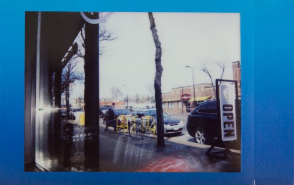
Finally, a Polaroid Week post part 1

Back in April (really, has it already been that long???) the online photo community I am part of celebrated another Polaroid Week. It has been quite some time since I have taken photos using instant film…my SX-70 had been out of commission, and the glass plate in the Polaroid back for my Hasselblad had two large cracks in it.

But this year, something drew me to participate in Polaroid week. I was able to fix my SX-70, and removed the broken glass from my Hasselblad’s Polaroid back. I pulled a few of my favorite Instax Mini photos taken during our last trip to Okinawa, and went on a couple of photo walks with my Hasselblad and SX-70, and pulled together enough photos to participate in the entire week.

And I am managing to use up a bit more of the film I have hoarded in my film fridge…

Here are a few that I posted during Polaroid week…

56 7 10 13 14

You can see more photos in the Polaroid Week pool on Flickr here!